The data of cities and their understanding by the communities living in them are crucial for social and democratic development. Here is why
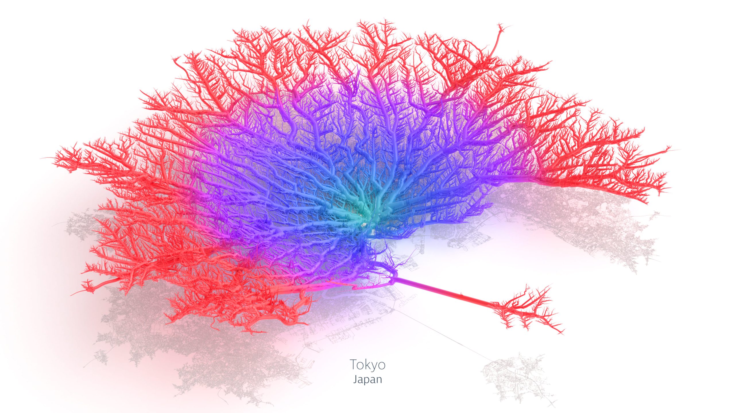
The Toronto coral is red, with a heart slightly veiled in blue and a skeleton well divided into ordered quadrants. Different from the Oslo or Honolulu coral, which develops on central skeletons, with small branches. The most complex are the corals of Paris, San Francisco, and Melbourne, with branched and intricate veins.
We are not talking about new coral reefs grown in cities but about data, sustainability, transport, and the Coral City data art project.
Craig Taylor, a 3D and data artist, has transformed the urban infrastructure of the world’s1 major cities and commuters’ movements into beautiful corals, representing how far one can travel from the city centre by car in 30 minutes.
Roads and infrastructures that morph into delicate veins, and geospatial analyses turn numbers and patterns into colours and branches. The result is a series of unique images that prompt contemplation about our movements in the largest cities in the world and, more profoundly, compel us to question the relationship between data and its comprehension, between community governance and democracy. But let’s proceed systematically.
The Power of Data Art
Understanding data and what they tell us is fundamental to having a more objective context of what we experience firsthand: to know, gain awareness, and therefore be able to decide.
However, data are hardly easy to read and even less so “attractive” at first glance: for many people, facing a chart, a grid, a sequence of numbers, or more complex systems can be a repellent experience. Are you one of these? This is where Data Art comes in.
«The power of data art lies in attracting the audience to explore further: what may not be immediately obvious becomes more recognisable as one delves deeper, and I find this to be a fascinating concept to play with», explains Taylor. «Coral Cities is a great example: it utilises real-world geography and a unique visualisation method to transform road networks into something recognisable yet different enough to prompt a “second look”».

Craig Taylor is Senior Data Visualisation Design Manager and 3D artist. He describes himself as a ‘creative data artist’, specialising in transforming motion data into visual representations using design and animation.
Browse all his projects
Craig Taylor, a Welshman, is a Data Visualization Design Manager: currently, he leads the data visualisation design team at Ito, one of the leading companies in managing transportation data. Here, Taylor specialises in transforming urban mobility data into visual representations. «I like to think of myself as a creative data artist, with experience in the field of space science2».
I find it captivating the alchemy of transforming raw data into something visually appealing; being able to visualise data in new and interesting ways allows us to appreciate the patterns and complexities that a dataset can contain in a different light»
Taylor’s work is directly linked to the development of cities and urban agglomerations, hence their ability to be increasingly accessible and sustainable. «My work is heavily transit-oriented, with a mission ultimately to ensure that public transportation is safe, efficient, and sustainable,» explains Taylor. In the past year, he has dedicated himself to exploring the impact of accessibility on a city: what happens following interruptions in public transportation? How does removing a vital bus route affect how people move around? «Visualizing these concepts helps us rationalise why certain networks exist, understand what additional services might be in demand, and ultimately pinpoint their placement» emphasises Taylor. «Data visualisation and spatial analysis provide a data-driven response to some intriguing questions. Exploring all facets of public transportation data, from accessibility to punctuality, ensures that communities know how networks impact people’s lives».
Data and Democracy
Taylor thus opens a scenario that goes beyond the aesthetic aspect and questions the relationship between knowledge and democratic participation.
The role of data visualisation and data art in understanding numbers and algorithms is closely linked to the state of democracy in our communities, especially in large cities. The relationship between knowledge, data, and the development of large urban agglomerations has long been the focus of numerous academic studies and analyses that highlight, from various perspectives, the role of data genesis in community governance processes.
The study Governing the informed city: Examining local government strategies for information production, consumption and knowledge sharing across ten cities3 reveals three models of local administrations related to data, which are quite distinct: data producers, data consumers, and information intermediaries. «The question of “who” produces urban data, as well as the analytical solutions that accompany them, on what types of urban issues and for what purposes, has become crucial,» write researchers Katrien Steenmans, Enora Robin, Michele Acuto, Ewa Iwaszuk, and Liliana Ortega Garza. «The information needed for evidence-based urban policy is often fragmented and not available in many cases (especially in the Global South), so local governments increasingly rely on private sector expertise to collect, process, and communicate data to inform their policies».
Sponsored ad
Sponsorizza con noi
The connection between data neutrality and community governance is evident. «The ability of cities to produce their knowledge presumably makes them less dependent on external actors (especially corporations) to generate information relevant to policies. It allows them to produce information aligned with political priorities and localised urban challenges. The more control democratic institutions have over the modes of knowledge production, the greater the potential for including citizen-based knowledge in the decision-making process».
Only those capable of producing transparent and community-driven data can claim to be safe from the risk of external influences and models. «Cities need to become more reflexive to ensure the investment of resources into information management serves a purpose of continuous learning rather than evaluation efforts that are designed as a box-ticking exercise (and sometimes commissioned to private consultancies). In other words, rethinking the ways in which external advice is sourced […] appears essential». The study concludes by stating, «moving beyond the light-use of consultative online platforms and consultant-based services to support institutional and technological mechanisms that allow to co-produce, and co-evaluate urban strategies».
The Cities of Opportunities

Vittorio Loreto directs the Sony Computer Science Laboratories – Rome (Sony CSL – Rome), a Sony – Enrico Fermi Research Centre (CREF) joint initiative. The laboratory is located in the historic Enrico Fermi Research Centre in Via Panisperna (Rome), the iconic place of the so-called ‘Ragazzi di Via Panisperna’.
Discover all Sony CSL projects here
The evolution of the relationship between data and cities starts from this new awareness about the genesis of the numbers describing communities, leading to a central node in the analysis and thus in the governance of cities: who produces the data? How are they used? How are they shared? With whom? For what purpose? In other words: objective data alone are no longer sufficient.
«We cannot a priori believe in the goodness of data», explains Vittorio Loreto, Professor of Physics of Complex Systems at the Sapienza University of Rome, Department of Physics, as well as the director of Sony Computer Science Laboratories (Rome). «Objective data alone cannot represent the totality of reality: experiences, sensations, and the values of the people who live in cities are missing. Subjective data are also needed to imagine future scenarios and thus make shared decisions».
Loreto and his team arrived at this consideration based on their experience monitoring over ten thousand cities with more than 10,000 inhabitants. «The objective data that emerge from a city are numerous», continues Loreto. «The data on services, points of interest, attractive locations, public transportation, and individual mobility. Numbers that, when cross-referenced with data related to census classes, reveal the relationship between the radial structure4 of all cities in the world and elements of heterogeneity, and thus inequality, regarding access to various points of interest. They remain data that indicate, for example, the distribution of services in the territory but not their quality or the level of satisfaction of the local communities that use that point of interest».
Thus the City of Opportunities is born: «Today, large urban agglomerations tend to invest in what is called the “proximity city” or the “15-Minute City.” It’s a model that cannot be applied everywhere: it doesn’t work well, for example, in what we call “intermediate zones,” with low population density5. We need to think in terms of opportunities, redefining the concept of proximity to focus on people’s needs, their aspirations».
Alongside objective data on times, distances, and means of transportation from point A to point B, we should incorporate data on people’s experiences and values as they undertake this journey. «The point is not just reaching points of interest within 15 minutes, but obtaining what we need and require within a reasonable time» emphasises Loreto. «Not to maximise time, but to use it as we believe is most appropriate for our desires, to decide how much time to dedicate to an activity. The question we should ask ourselves in front of data is not what we want to achieve, but why we want to achieve it».
«One day we could imagine having navigators that suggest the shortest route and different routes that are more interesting for us and our interests. For example, a safer route if I am a cyclist, a route with more trees and greenery, or a route that passes by works of art that allow us to appreciate the beauty of the environment in which we live».
A paradigm shift that is closely linked to decision-making and governance processes. «The first step remains the shared listening of and between people» explains Loreto. «The tools for collaborative urban design and community awareness exist, and they are progressively gaining importance in urban and administrative education. A model of city governance that requires citizen engagement without understanding and explaining the overall picture is no longer sustainable. People are willing to share their experiences in the city: we need to listen to them, and the feedback on what has emerged and what has been decided must be returned to them. Care is needed».
- Starting with the world’s top 40 cities in terms of quality of life according to the 2018 annual ranking by the Mercel. ↩︎
- An approach to human geography focused on the analysis of spatial patterns and processes through quantitative methods, with the ultimate goal of establishing spatial laws (See Rogers, A., Castree, N., & Kitchin, R. (2013). A Dictionary of Human Geography. In Oxford University Press). ↩︎
- Steenmans, K., Robin, E., Acuto, M., Iwaszuk, E., & Garza, L. O. (2023). Governing the informed city: Examining local government strategies for information production, consumption and knowledge sharing across ten cities. In Urban Governance. ↩︎
- The development of urban agglomerations along the arteries radiating from the original core of the city. One of the best-known examples is the city of Rome, where urban development was determined, starting from the original core, along the routes of the consular roads. ↩︎
- The map of population density in Italy processed by Eurostat and published by Il Sole 24 Ore (2023). ↩︎


